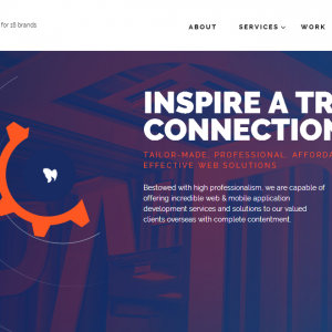
Owning a well-structured website is one of the major milestones that you, as a site author, can achieve to getting desirable traffic on your site. And in this context, what is not realized as important is the header of your website that makes it stand out from others. Well, the header is the first impression of a business and its objective, which is more likely to influence the conversions on the site. There are no particular rules to creating a header and definitely no limitations to make them creative.
When it comes to visibility, there is one golden rule i.e. “First impression is the last impression”. And following this rule, the professional web developers give more emphasis on creating an exclusive header that exhibits the theme and content of the site. The headers are specifically designed in accordance with the website’s need. For an instance, the header of a business website should be kept simple and highly professional. On the other hand, designing websites must flaunt creative and eye-catching header.
Still confused about how a header design would influence your business? Or you need some header design inspirations for your site? Here you go:
It’s time to explore the listed best header designs that would surely give you header designing goals.
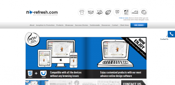
No-refresh features the impeccable use of visual hierarchy in its header. Beautifully placed header with well-annotated navigation goes perfectly with the site content. The mast banner effectively denotes the major technologies and their field of expertise. Such a type of header helps customers to distinguish and sort websites on the basis of their expertise and technology usage. Once you navigate below, a call to action button and demo option are also available to facilitate the first-time users.
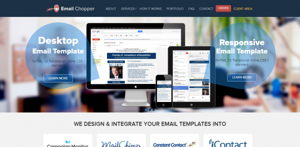
One of the most engaging websites that flash a custom navigation bar introducing icons that draw you to the other major sections of the site. The effective use of content in the header with changing font and size makes it more appealing and rememberable.
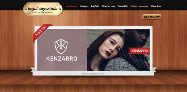
This website displays one of the most creative and artistically placed header designs. And do not miss the catchy tagline placed right below the logo. It makes the content more realistic and relevant. If you are a first-time visitor, I bet you would definitely like the way this site places its header and other content.
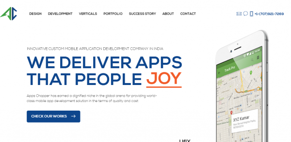
These types of header designs are my favorite as they feature the call-to-action button that effectively catches users attention. The catchy logo and tagline on top explain what exactly the site is all about. Hover to the navigation top and see how meticulously the background is matched with the header content.
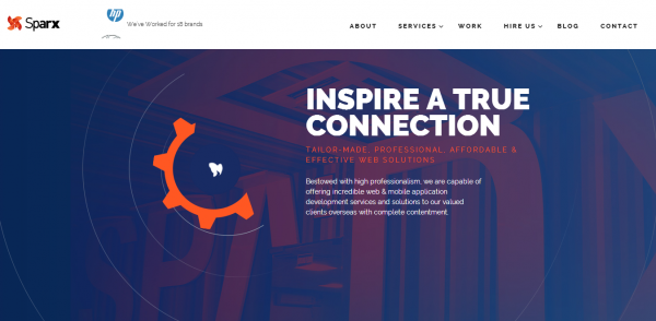
This is one of the inspiring headers I have ever come across. Browse to the navigation top and you will get the best view of JavaScript. The proficient use of animations makes this header more lively and dynamic. Moreover, the aptly placed content compliments the visibility more.
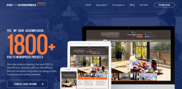
This is a perfect example of a website with the advanced header having animated graphics that make the site look more appealing and lively. The exquisite content display in diverse fonts and style with complimenting color combination makes it stand out amongst the other.
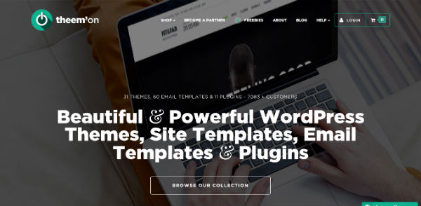
theem’on exhibits an impressive header with precise content placed artistically on the page. The animations and illustrations in the background make the site look more convincing, dynamic, and realistic. This is some kind of header that a new user will certainly notice.
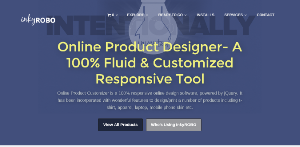
If you are a first-time visitor to inkyROBO or have already visited the site earlier, the header is the first thing to get your attention. This header is not just creative but also focused towards showcasing the objective and content of the site. The call to action button on the header makes the site navigation easier for the new users. The innovative background of the header with soothing colors makes it more pleasant.
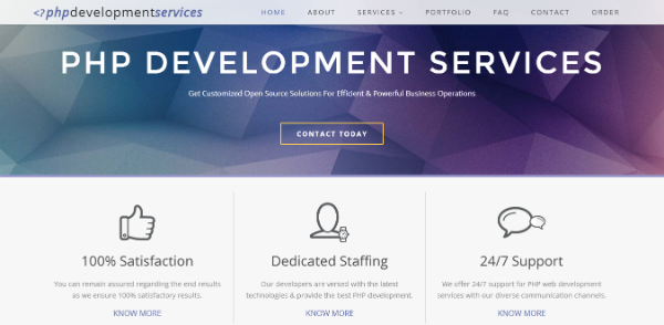
The simplest header with minimalist color usage makes it look more business-like and corporate. The “contact today” option added on the header makes it more accessible for the first time visitors. The simplified navigation makes it more appealing.
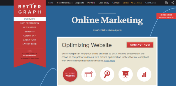
The header of this website is truly inspirational and artistically designed with the use of diversified and dynamic technologies. The colorful banner on the left displays the necessary tabs required to browse the site further. Such easily navigable headers are more popular among new as well as established users.
So here we end up with this list of most amazing header designs that have inspired the header designing trends of 2016. Feel free to share your feedback in the comment section below.

