
The ingredients that make a website successful in the long run are many. Building a website and putting a lot of content on it isn’t just what it takes to make a website successfully. There are tons of different factors that contribute to make an online business a remarkable success. Smart entrepreneurs and business owners need to make sure that their website is not only fully responsive but also provides a roadmap to visitors.
This is my 7th year in internet marketing and a lot website owners contact me for consultation services. Whenever a client asks me to audit their site to analyze why they are experiencing increased bounce rates and a decline in conversions, the very first things I check for is their website load time and CTAs.
Importance of CTA’s
CTA’s are called call-to-actions for a reason. Without effective CTA’s your website is like a jungle without a map, and nobody wants to land on a website with no apparent directives. This is why CTA’s are critically important, they keep the visitors engaged and make them do what you want them to do.
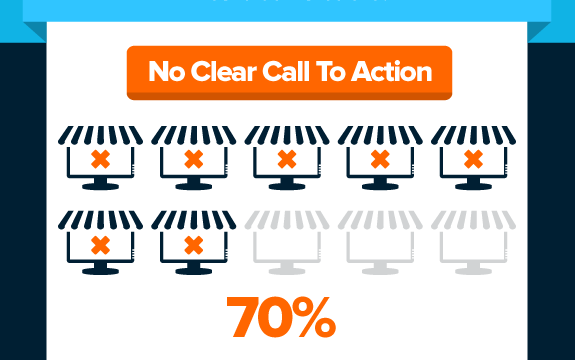
The problem with many online business owners is that they often undermine the importance of CTA’s. For them, it’s like a strange thing to worry about. Almost 70% of small business websites do not have clear call to actions on their homepages.
Today, customers have more control over the buying process, and they are likely to abandon a website if it fails to guide them through the conversion process.
CTA’s are an integral part of usability and they make your website an interactive platform for the customers to purchase your products or services. Moreover, they are fast and hassle-free means to convert your visitors into customers without compromising large spaces on the website. As a beginner in the industry, you might find yourself at the cross roads principally deciding what areas to focus to make your CTA’s more effective.
In this article we have shared 6 useful tips can make your CTA’s more powerful but also conversion savvy for your website.
- Carefully Pick Your Verbs
Text and the use of right actionable words may appear to be the most basic thing, but the fact is that they help users identify the purpose and remove all the potential communication barriers. CTA’s cannot work without text, so it is important to make the right use of textual content.
It is good to combine and engineer words that are likable and situation friendly. Make use of timing words such as “register today” or “Join us now.” Try to avoid using boring words like “submit” or “enter.” Replace them with more action-packed words like “get,” “reserve,” “try” or optimistic words like “yes.”
Here are some examples
- Download Your Free Copy
- Get Your Free eBook
- Get Tickets
- See the Pictures
- Color Sense
The color of your buttons matters and is imperative to the entire scene. You cannot undermine the use of right colors as they hold significant influence over the user’s decision-making process. If you want to invoke a response that turns visitors into customers, you must choose a color scheme that accentuates the CTA and also maintains harmony with other elements.
There are certain colors that can grab attention. It’s better to create a variety of buttons and take a glance test to see which color works. And again, you must ensure that color doesn’t clash with the overall page hierarchy.
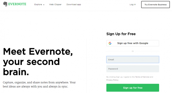
Let’s take an example of a popular B2B company and see if they think the same way. Soon as you land on Evernote’s website, you can immediately understand the purpose of the website. Moreover, the green color of CTA’s is exactly the same green as on the headline and the Evernote’s logo all of which jump off the page and make the CTA more powerful and interactive.
- Take a Good Look at The Design
Button shape and design play an important role as they help distinguish the CTA against the page hierarchy. There are several things to consider when attempting to crafting the perfect design for your CTA button as they can make huge leaps in the conversion process.
You can either go with a more rounded button shape or a button with square edges, provided if it fulfills the criteria of an appealing look. You can also use special effects like color blinking, flash animations, and 3D effects to bring your CTA’s into the limelight.
- Size is Important
Size of CTA is important in every aspect. It should be visible enough and must keep the page in balance. Size not only helps grab the attention of the user but also improves readability, enhances mobile experience and makes it more usable in terms of tapping and clicking.
However, it should not be small enough that it easily gets overlooked and large enough that it distracts users from the content of the rest of the page. The best thing is to keep the dimensions of the CTA in good books with the subject and the proportion of all other elements as well.
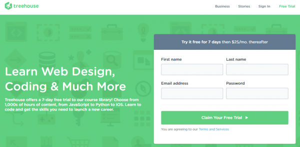
Treehouse CTA is an example of CTA that generate leads. The dimensions definitely make it stand out more, but at the same time they don’t go overboard. Apple recommends a minimum size of 44 x 44 pixels for anything clickable.
- Focus on the Placement
The placement of CTA’s can be tricky. The fact is that there is no specific guide to it and even some of the top ranking websites face troubles when it comes to choosing the ideal position for CTA’s. Some sites in an attempt to grab user attention place CTA’s in illogical positions and end up annoying users.
The placement of CTA must feel natural. If your CTA is price-oriented, then make sure you place it close to the pricing of your product or service. However, it should appear naturally in the context of the rest of the page.

A great example of position can be found on Trello’s website. It is rightly located upfront in an easy-to-find spot and the best part is that it follows organically with the flow of the webpage.
- Lead with the Subject
It is always a good practice to lead with the incentives you are offerings. CTA’s that read “25% discount on all products” will definitely grab more attention compared to the one that says “Click Here and Get 25% Discount”. There is not much of a difference, but subtle things do matter in CTA’s.

Try to divide the attention by showing them what makes you different and why your product is worth buying. Your CTA’s must deliver the subject of the offer the second your customer lays eyes on it. Another popular way is to present your offer in a sleek as done by FME.
The original price is kept in dull grey and the discounted price is in flashy orange making it pop off the page. This contrast ensures that visitors are drawn and get allured by the premium offer and take the prospective action.
Conclusion
To be honest, there is no one-size-fits-all strategy when it comes to creating the perfect CTA’s on your website. However, the above mentioned tips and tricks can help your CTA’s reach higher levels of engagements and produce greater amount of sales.